June 16, 2011
Bringing Polish to Movable Type and Melody
I was recently participated in an interview with CMS Critic about the current status of Melody, which recently released it first production grade version of the software. If you don't know, Melody is an open source content management system and blogging platform that both Jay and I devote a lot our personal and professional energy into. Melody is an off-shoot of Movable Type, the blogging platform largely credited with fueling the blogging industry's growth early on.
At the end of the interview, which we naturally think is worth reading in full, we talk about what the community is planning for Melody 1.1. Here is an excerpt:
CC: Are there any major upcoming enhancements or features that you are working on for the next release that you'd like to share with us?
BR: Melody 1.1 development is already in full swing. With every release we focus on improving both the core architecture of the product as well as building new features that users would find both exciting and valuable.
On the backend we are working to create a cleaner separation between our templates and the javascript that powers much of the user interface. This paves the way for us to shed the highly proprietary javascript that powered Movable Type, and in turn embrace a more robust and well supported framework like jQuery.
We are also looking to completely retool Melody's dynamic publishing engine so that designers can more easily take advantage of it when building and designing web sites.
We are also working to backport more of MT5's more popular features, like its new listing framework that provides a much richer, and more flexible way of managing content within the admin UI. It also makes it much easier for plugin developers to build their own custom listing screens and further reduces the amount of Perl one has to know in order to build a plugin.
And lastly, my company, Endevver, has spear headed a project to incubate a new design for the Melody user interface. Our desire is to release the new UI as a stand alone and optional plugin alongside Melody 1.1. This will give the new UI time to mature and stabilize, and give the community time to get used to the new design... and if they like it, hopefully fold it into the core distribution at a later date.
This marks the first time any we have talked openly about our project to offer users of Melody an alternative to Movable Type's default design. And now that the cat is out of the bag, what better time to introduce our project to the rest of the world?
So what motivated Endevver to take on this project?
First, there was a consensus among members of the Melody community that Melody's user interface be clearly different from Movable Type. Given our resources at the time, we were limited in how drastic of a change we could make, and thus limited ourselves to simply changing the Movable Type logo, and the default color scheme of the application. Those changes were necessary, but I don't think any of us felt they were sufficient.
Second, one thing that Endevver felt was always lacking in Movable Type's design was polish. Movable Type 4 offered a visually striking design, but as with most projects on a very tight schedule, as MT4's launch was, many of the user interface changes Six Apart wanted to make in conjunction with the new visual design were put on the back burner for a later release. These were all changes that taken by themselves were clearly "non-essential." They were changes that could never in a million years be mapped directly to a revenue opportunity, and because Movable Type's roadmap was so strongly driven by the enterprise and commercial markets, these features were perpetually sidelined. As a result, much of the polish envisioned for MT4 never happened.
Finally, our understanding of how people like to work within content management systems that support multiple web sites, like MT4, MT5, Drupal and now WordPress, has grown considerably since Movable Type 4 was initially released in 2007. We therefore wanted Melody to incorporate as much of this accumulated knowledge and experience into whatever we would build next.
In summary, we wanted to create a user interface for Melody that was not only differentiated from Movable Type visually, but also offered a more compelling user experience, one that was above all else the more polished than anything that had come before it.
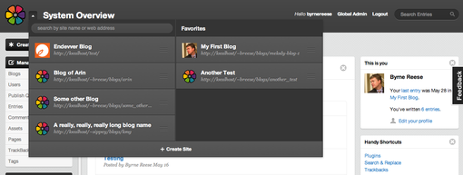
A lot of attention in particular has been paid to how one navigates and moves between blogs. We wanted users to be able to move from one to another as efficiently as possible. To that end we have done a number of things:
- Users are allowed to maintain a list of favorite blogs that they can drag and drop blogs into.
- Users are allowed to search the system for a specific blog and navigate to it without ever having to navigate to a separate screen to do so.
But even with these great features, we found that scanning a text list of blog names was still not very efficient. Therefore we wanted to provide a way for users to more readily scan for a particular blog they might be looking for among a large list of blogs. What we came up with was the ability for administrators to optionally associate an icon with a blog. This icon is then used when presenting users with a list of blogs, so that they can more quickly scan for and find a particular blog.
This icon became a great way to customize a blog's appearance inside the application, so we added the option for users to also associate a color with their blog. When used together, each and every blog in Melody can thus be personalized and themed. This not only allows a blog to take on its own unique personality inside of the CMS, but it also helps cement within a user's mind the current context they might be operating within.
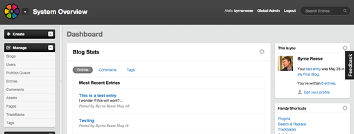
We are incredibly excited about this project and expect in the coming weeks to have a more formal release ready, when the first alpha builds of Melody 1.1 are made available. In the meantime, we hope the following screenshots will whet your appetite and peak your curiosity. If you want to participate in the project, then you are encouraged to join everyone at Endevver over at Melody's mailing list. We hope to see you there!
Dashboard
Dashboard w/Blog Selector Expanded
Blog Themes


Looks very promising Byrne! Looking forward to seeing it in the wild.
~Mike
You’re doing a fantastic job with this new interface initiative!
Looking at the screenshots you’ve made public, I feel like the new interface would beat any publishing platform admin interface among the ones that I’m aware of.
Congratulations!
Kind Regards, Mihai Bocsaru
Daily Movable Type Consultant
http://www.openmelodydemo.org/ http://www.movabletypedemo.org/